Master the art of crafting a science poster. Find out how to clarify experiments using illustrations and compelling questions.
A Better Science Poster Starts With a Question, Not a Pretty Picture
Estimated reading time: 7 minutes
Your class has recently investigated heat loss, and now everyone needs a science poster. The measurements are ready. The difficult part is explaining them to someone who missed the experiment. A dramatic image of a glowing house might attract attention, but it will not explain why one insulation material performed differently. Students can explore illustration concepts through platforms such as Kimg AI, which offers AI image generation and reference-based editing. The challenge is using such images to clarify an experiment without allowing an attractive picture to masquerade as scientific evidence.
Give the Poster One Job
Start by writing the question a visitor should answer after thirty seconds. For the insulation project, that might be, “Which material slowed cooling in our classroom test?” Put the question near the top of the poster. Below it, arrange the method, actual measurements, and conclusion in the order someone would naturally follow.
Students sometimes begin with a decorative title and discover that the graph, perhaps the most important piece of the project, has nowhere comfortable to fit. Reverse that process. Place the graph first, then reserve space for a simple drawing of the test setup and a brief explanation. A clear diagram can reveal where the thermometer was placed or how the containers differed.
A poster succeeds when an unfamiliar reader can follow the reasoning without the student standing beside it. Decoration may draw them closer, but the evidence should keep them there.
Also Read: How Math Shapes Our Understanding of Cosmology and Particle Physics
Build Visuals Around Three Scientific Purposes
Not every image on a STEM poster serves the same function. Identify whether a visual explains a procedure, illustrates a concept, or documents an observation before deciding how to make it.
1. A Procedure Diagram Shows What You Did
A procedure diagram should identify the containers, thermometer, insulation, and sequence of steps. Draw it from your actual experiment or use your photographs as references. If an AI tool is involved, describe the arrangement carefully and compare its output with your lab notes. A generated picture may add a sensor or move a thermometer to a photogenic position. That change is not harmless when the image is supposed to show how the test was performed.
2. A Concept Illustration Shows What You Mean
An illustration can help a reader imagine something that is hard to see directly, such as heat moving from a warm object into cooler surroundings. Use a simple visual metaphor, then label it as an illustration. For example, arrows may represent the direction of heat transfer. Their size should not imply numerical measurements unless the underlying data supports that interpretation. Keep the art subordinate to your explanation. A scene with no clear labels can be harder to understand than a hand-drawn sketch.
3. An Evidence Image Shows What You Observed
Photographs of the actual experiment belong in a separate category. Do not replace a blurry experiment photo with a realistic generated reconstruction and present it as documentation. If the image is too poor to show the setup, retake it when possible or describe the method with a clearly marked schematic. Keep the original files and measurement sheet. A viewer should always be able to distinguish an observed result from a picture made to explain an idea.
Write Image Instructions Like a Lab Protocol
Vague descriptions invite irrelevant details. “Science poster about energy” could produce anything from a wind turbine to a futuristic city. A better request identifies the subject, visible components, camera viewpoint, and exclusions. For example: “Simple educational illustration of two identical cups, one wrapped in insulating material, seen from the side, with clear empty space for labels; no extra equipment.”
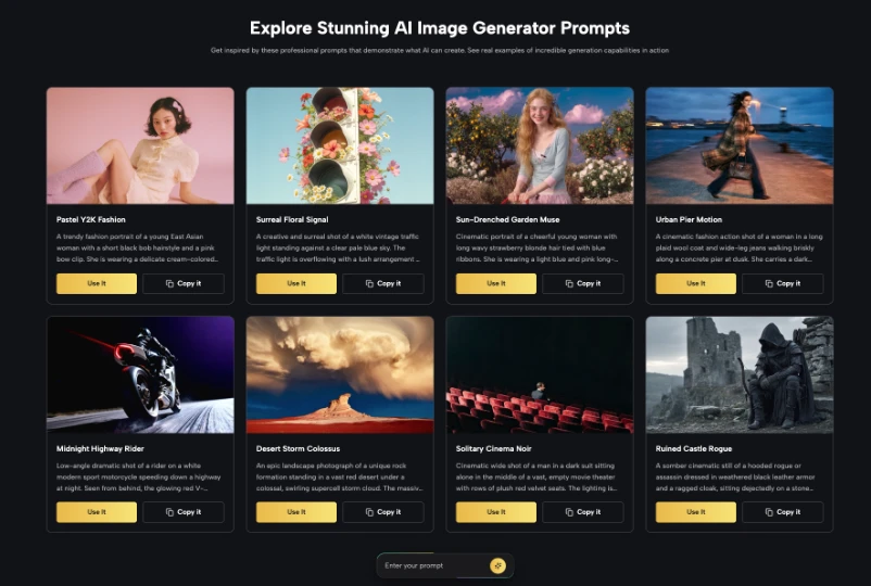
If the project includes a real apparatus, start with its photograph. Kimg’s Nano Banana AI image options describe reference-image transformations, which can be useful when exploring a clearer illustration of an existing object. Still, verify the output against the source. Count the cups, compare the tube positions, and check any displayed text.
Keep a record of your prompt and revisions. This makes it easier to explain how you created the illustration if a teacher asks. It also turns the image-making process into an exercise in writing precise instructions and checking whether a tool followed them.
Let Data Keep Its Own Visual Language
Students should make charts from actual measurements, not ask an image model to invent a graph that looks plausible. Enter the observations into a spreadsheet or graphing tool, choose a suitable axis scale, and include units. If temperatures were recorded at five-minute intervals, show those intervals faithfully rather than smoothing away awkward changes.
A useful poster might pair a real line graph with a separate illustrated cup. The graph answers what happened; the picture helps explain what was tested. Give both clear captions. Avoid placing floating percentage labels or striking arrows on an illustration unless you can point to their source in your recorded results.
Color can link related parts of the page. For example, blue might identify the wrapped container in the diagram and the same data series in the chart. Keep an additional text label so the poster is still understandable if someone cannot distinguish the colors. Visual consistency should support interpretation rather than replace it.
Use an Error Check Before Showing the Poster
Print the draft or view it at the size it will be displayed. Check every number against the original table. Read all labels aloud. Look for units, captions, and unexplained abbreviations. Ask a classmate who did not perform the experiment to describe the setup using only the poster. Their questions often reveal missing details more quickly than another round of visual polishing.
Review generated illustrations with the same discipline. Does a hand have an impossible number of fingers? Is a battery connected to a component that was not in the experiment? Has a diagram placed a heat source on the wrong side? A small visual mistake can create a large scientific misunderstanding.
Finally, check your school’s rules on AI-assisted work. Some assignments require disclosure or restrict which parts may use generated materials. Put a brief note near the relevant image when appropriate. Clear attribution strengthens the presentation because readers know which elements are data, photographs, and explanatory artwork.
Make the Presentation Work Without You
A science fair visitor may arrive while you are speaking with someone else. Design for that moment. The opening question should be visible from a few steps away, the graph should be legible at ordinary reading distance, and the conclusion should answer the question without exaggerating what the experiment proves.
Add one short limitations statement. Perhaps the class tested only two materials, or the room temperature changed during the session. That does not ruin the project; it shows that you understand the boundaries of the evidence. An illustration cannot repair a weak method, and a beautiful poster does not turn a small classroom test into a universal claim.
Also Read: Is Your Body Electric? The Amazing World of Bioelectricity
Prepare a thirty-second explanation and practice it with a friend. If you keep pointing to the wrong part of the poster, consider moving the visual elements. Good design should make your explanation easier to deliver, not force you to fight the layout.
Science Poster Design: Conclusion
Science posters are opportunities to practice both communication and skepticism. Choose a clear question, protect your real data, and make each visual serve a defined purpose. Treat generated illustrations as editable explanations rather than proof that an experiment occurred. Then let a classmate test whether the page makes sense without extra help. For your next project, draft the graph and the main question before you design the cover image. The result can be appealing without asking appearance to do the work of evidence.
Reviewed by Dr. Charudatta Pathak on September 23, 2026Edited by Juveriya Khan
Note: The article includes external links to third-party services; readers should independently evaluate any referenced platforms before engaging.
- Author
- Latest Posts
I completed my Master of Science from the University of Allahabad in 2017 with a strong academic background in life sciences and chemistry. My specialization included Molecular Biology, Microbiology, Genetics, Plant Breeding, Phycology, Paleobotany, and Bioinformatics, along with Organic Chemistry, Inorganic Chemistry, and Physical Chemistry. This multidisciplinary training provided me with a comprehensive understanding of biological systems and analytical scientific approaches.
After completing my postgraduate studies, I gained valuable professional experience in both the education and social development sectors. I worked at A.M. Oxford Public School, where I was actively involved in guiding students toward academic excellence. In this role, I focused on creating an engaging learning environment, encouraging critical thinking, and nurturing students’ curiosity for scientific learning. My experience as an educator strengthened my communication, mentoring, and classroom management skills.
In addition to my teaching experience, I worked with Jeevan Jagriti Foundation, where I contributed to community-based initiatives aimed at improving educational access and awareness among underprivileged sections of society. Through this work, I participated in programs designed to support social development and promote the value of education in marginalized communities.
These professional experiences helped me develop strong interpersonal, leadership, and organizational skills while reinforcing my commitment to education and community service.